
UpBeat Focus-Enhancing Headphones


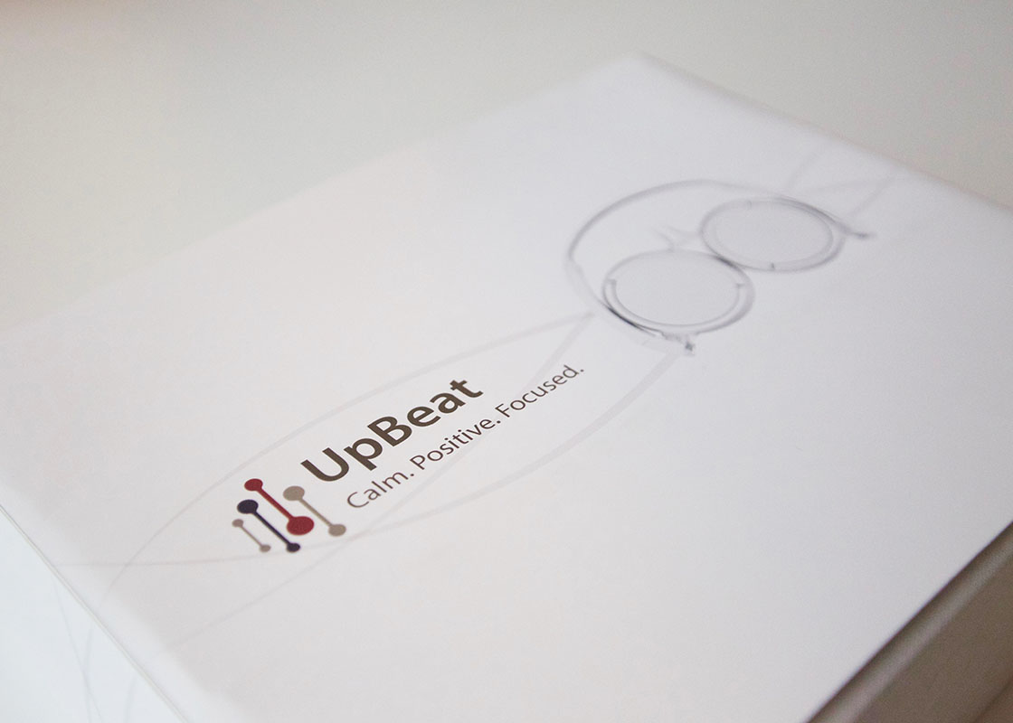
These headphones target those prone to stress in situations where concentration is necessary. The logo creates a sense of rhythm and balance, while the colors promote the soothing quality of the product.
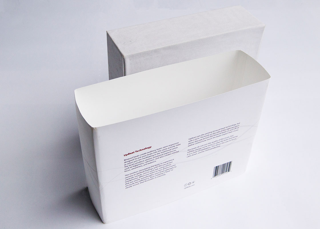
Packaging and a detailed brand book were all designed for this product. These headphones were designed to contend with their elite high-quality competitors. The design of the packaging had to represent this notion.
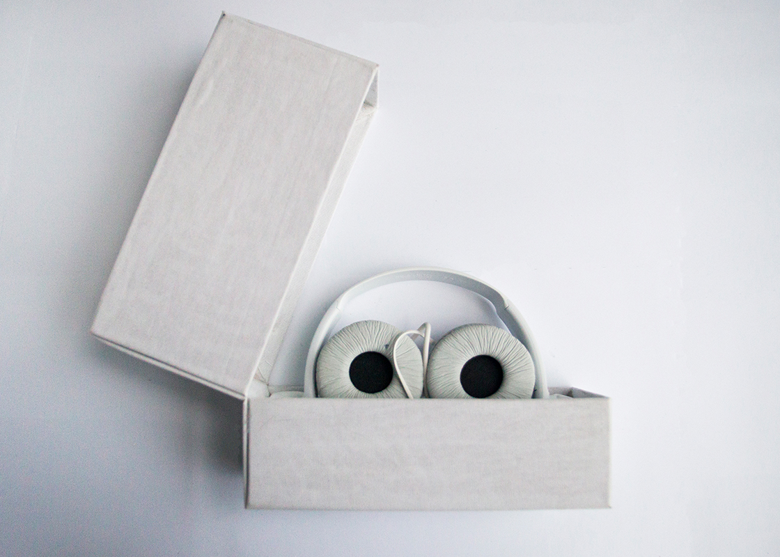
High-Quality Packaging
The packaging sets the tone for the product. The outside has very little context because the customer would already know about the product. Their views would be formed through advertising and website reviews.
The inside is silk lined to create a sense of luxury. A unique way of opening the box, as well as a simplistic design on the slip cover, intrigues the customer. It also implies that the product has quality manufacturing.
The Brand Book
The brand book sets specific guidelines for using the logo. It shows other designers exactly what to do and what not to do when working with this brand. There are detailed measurements, as well as typography and color specs.
The process book was designed like the brand book. It shows exactly what decisions I have made throughout the project. It includes sketches and even different ideas I considered in the beginning.
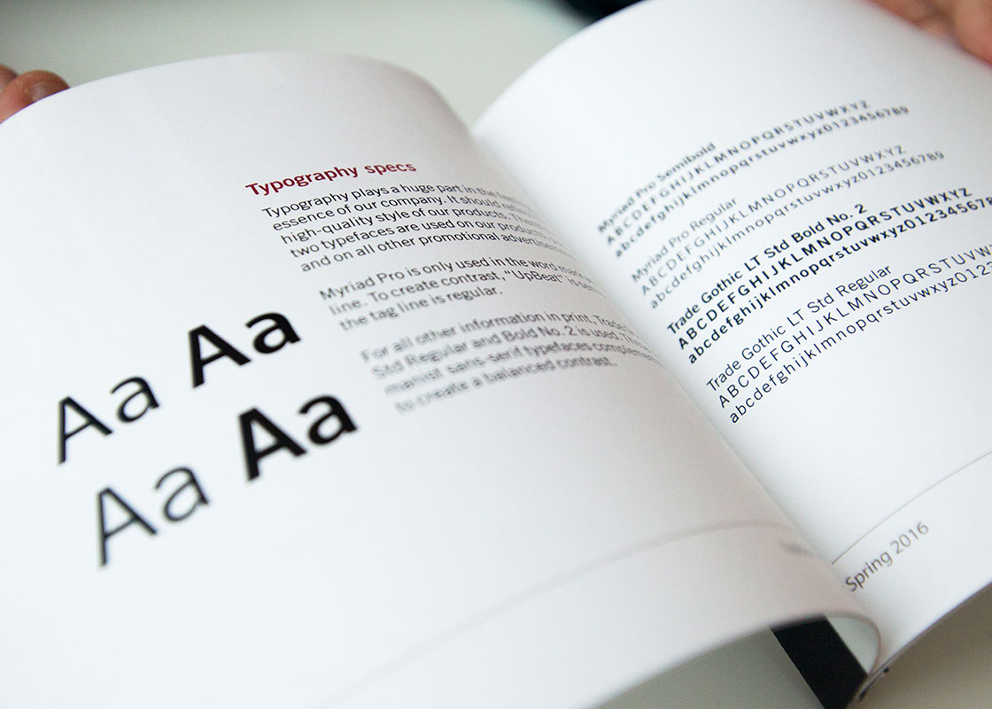
The Process Book
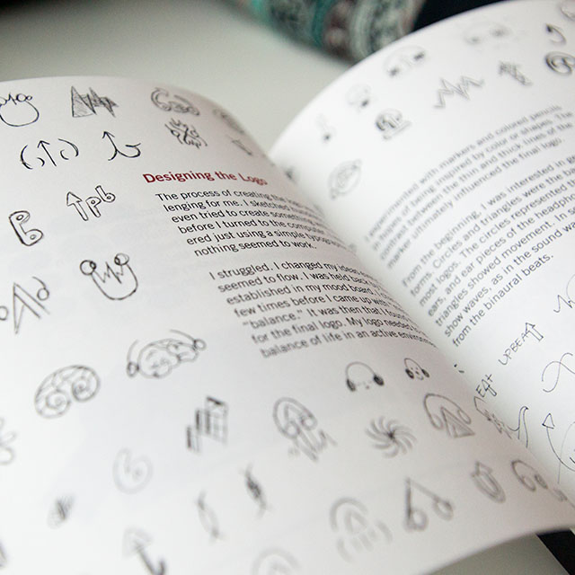
The process of designing the UpBeat Headphones logo took up the majority of my time in this project. I spent countless hours sketching ideas and playing with colors.
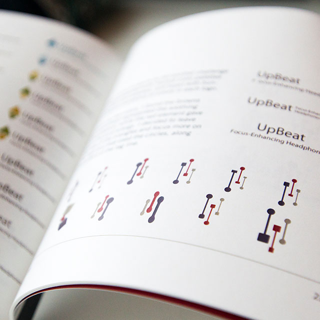
I ended up with abstract shapes representing the movement of sound. I then started using a more muted color palette, as it was easier on the eyes and mind.
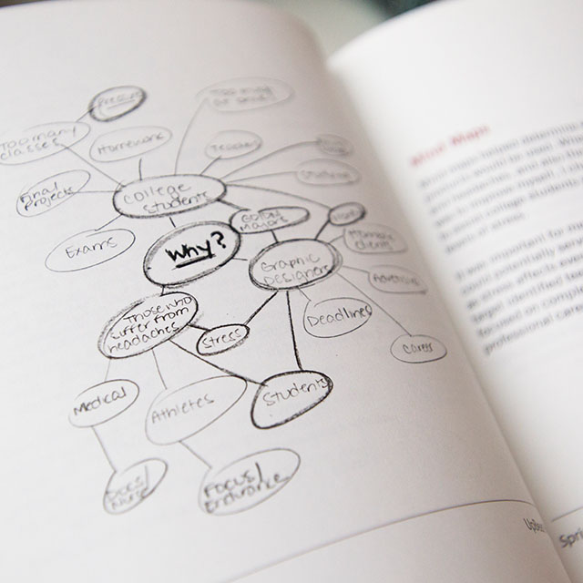
I found mind maps most helpful to get to the final logo. Once I felt like the design answered all the questions and requirements I set for myself, I knew my design was a success.